


After the bright event - the fashion week in New York, Pantone experts identified the most relevant colors and shades for the new season. The presented palette has not changed too drastically, but has become a little closer to nature and its shades. We propose to consider in more detail each of them. This in turn will help to choose trendy clothes and correctly combine the actual colors.
Trendy colors in spring-summer clothes
The colors, which were named by experts, are very organically combined with each other, so you can consider them universal. Thanks to this, it will be much easier to make beautiful bows not only for everyday life, but also for an evening out.
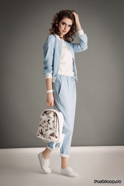
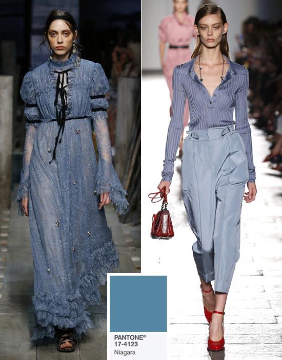
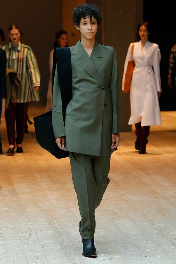
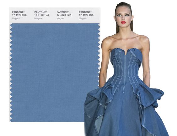
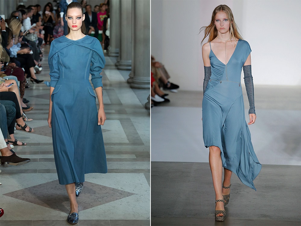
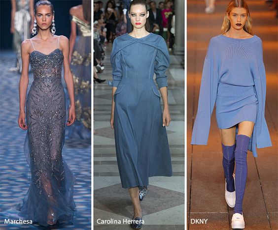
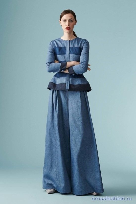
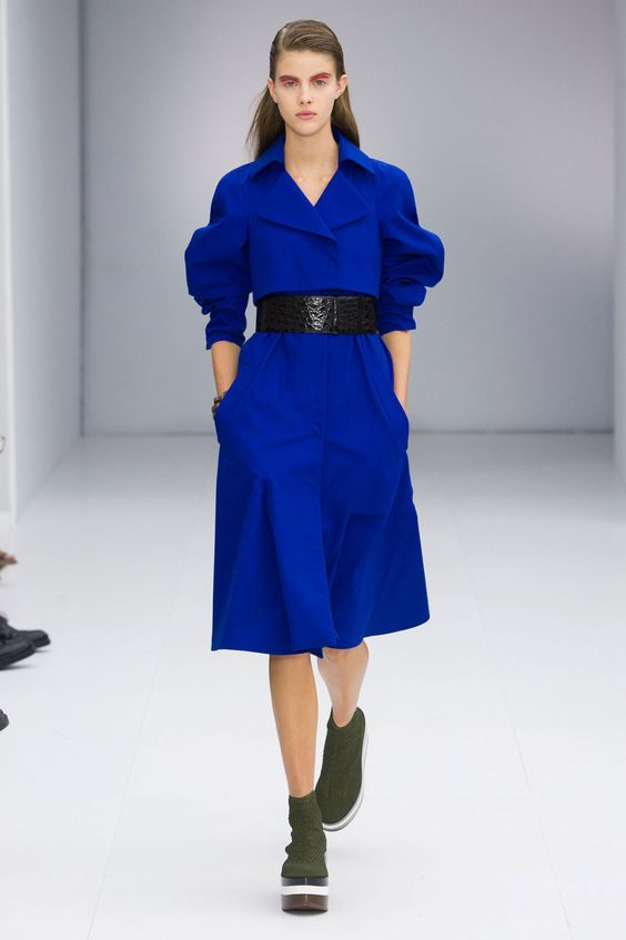
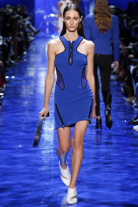
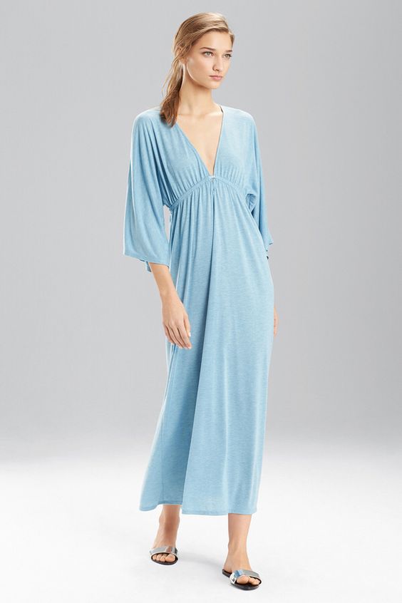
Niagara
The ash blue denim was named the most important this year. It personifies calmness, serenity and comfort. Therefore, clothes in this color can be easily combined with any other shades: from calm, pastel to bright, saturated. The best look is the images made in the style of casual. However, long dresses in the floor in the color of the Niagara also look luxurious.
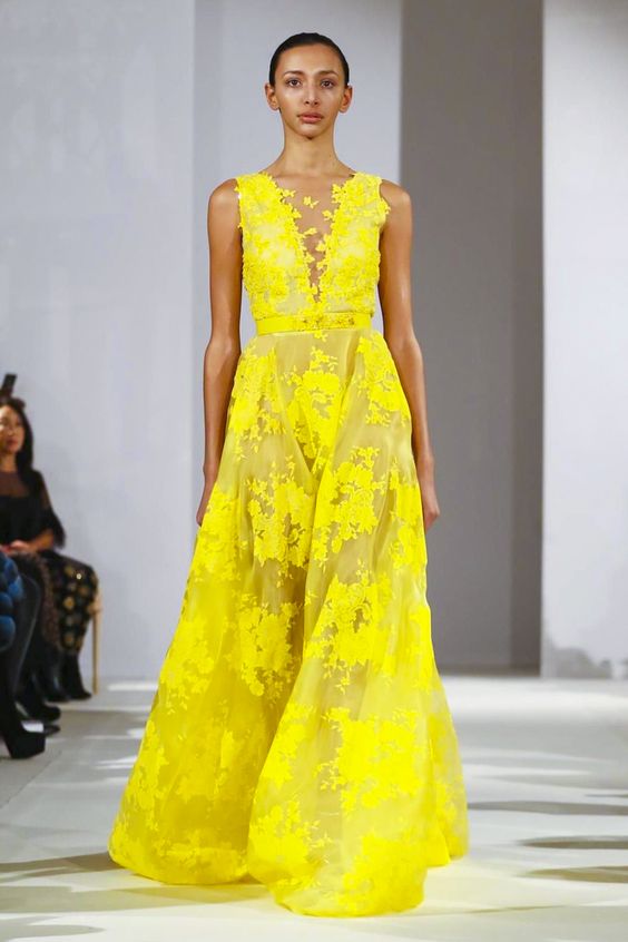
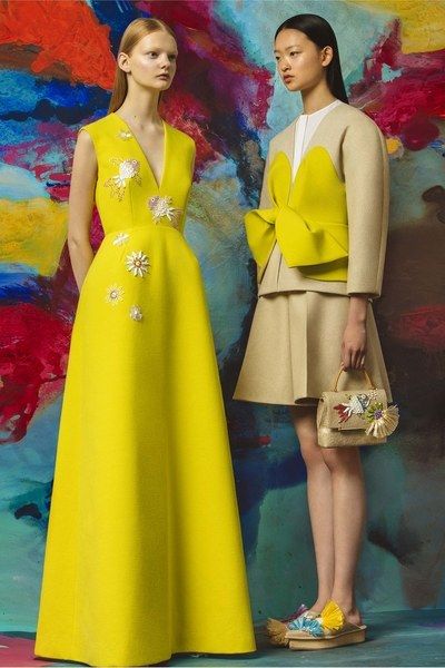
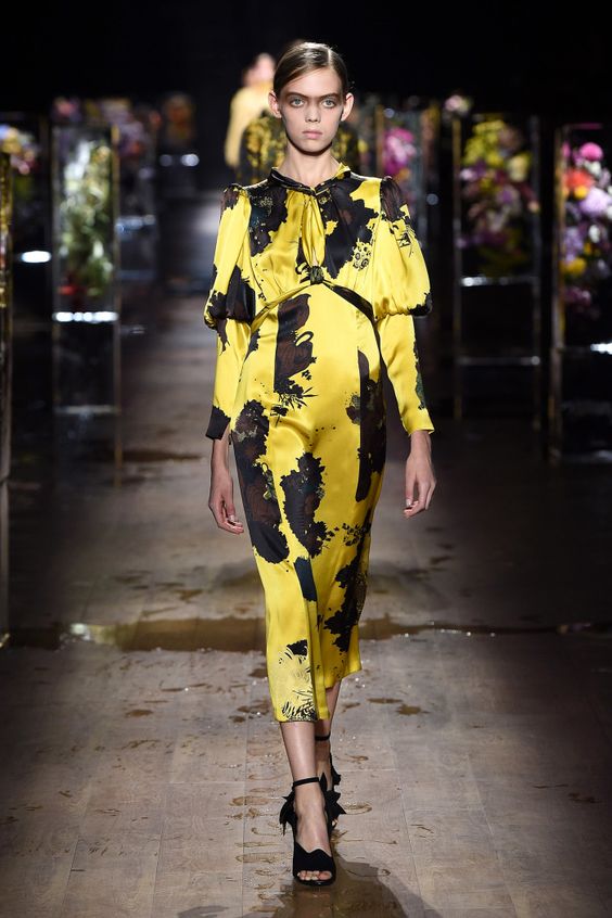
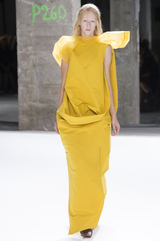
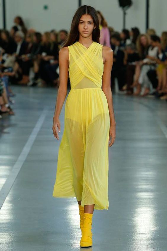
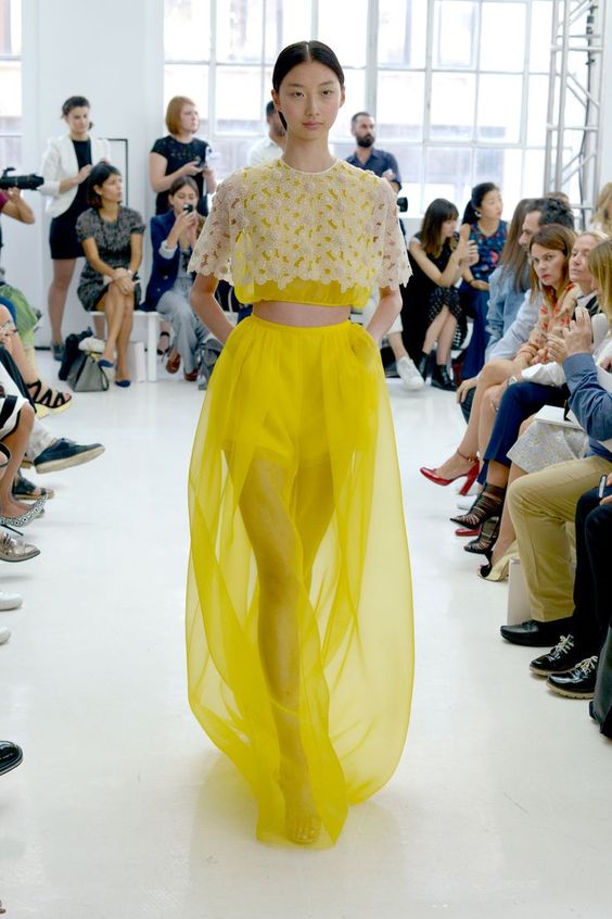
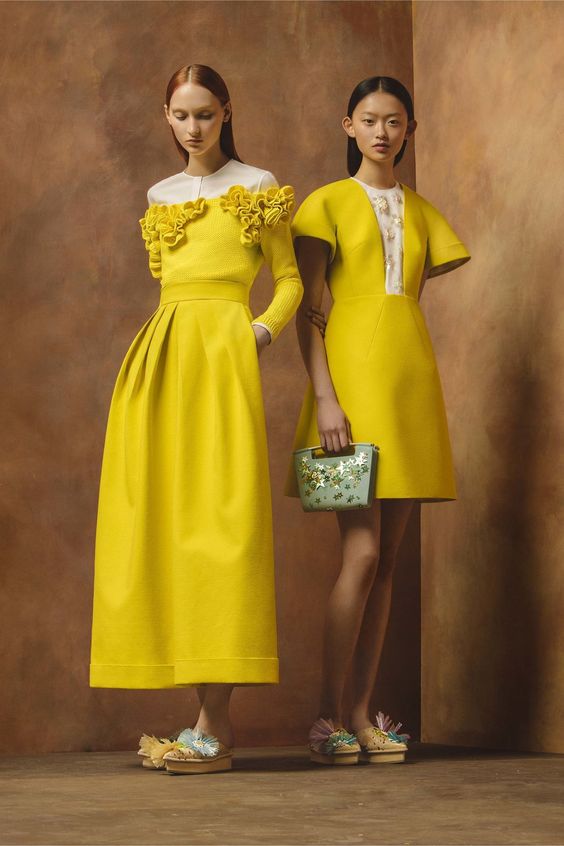
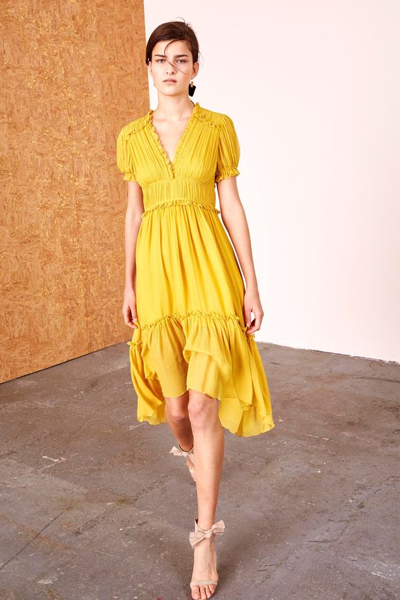
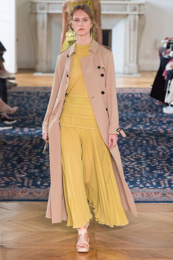
Primrose yellow
The next color that will be relevant in the spring-summer season is the yellow primrose or primrose. This shade is bright, saturated, so it will definitely cheer up not only you, but everyone around you.
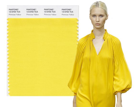
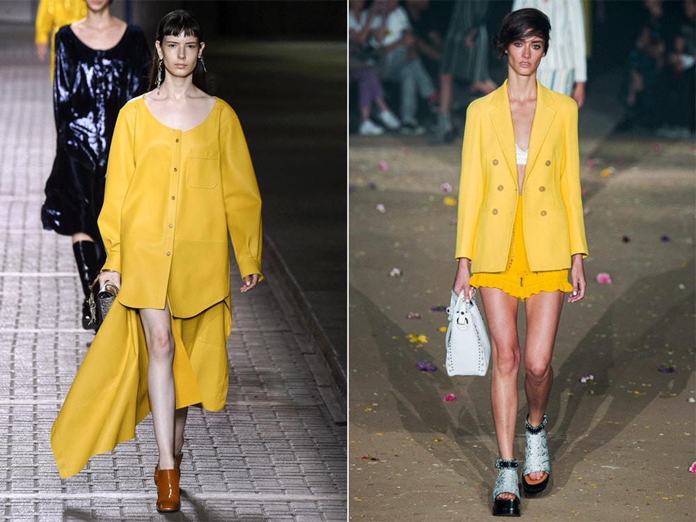
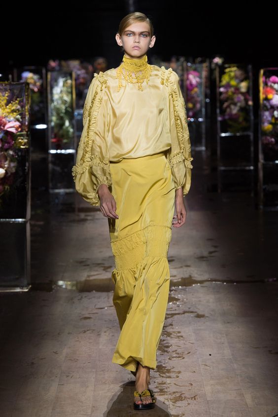
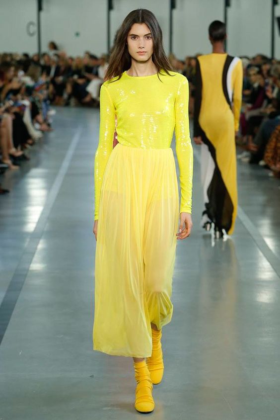
Combining clothes of such a sunny color is better with a luxurious touch of Lapis Blue or a neutral Hazelnut. Each of the options will look interesting in its own way, so choose a combination based on the event where you plan to go in such a bow.
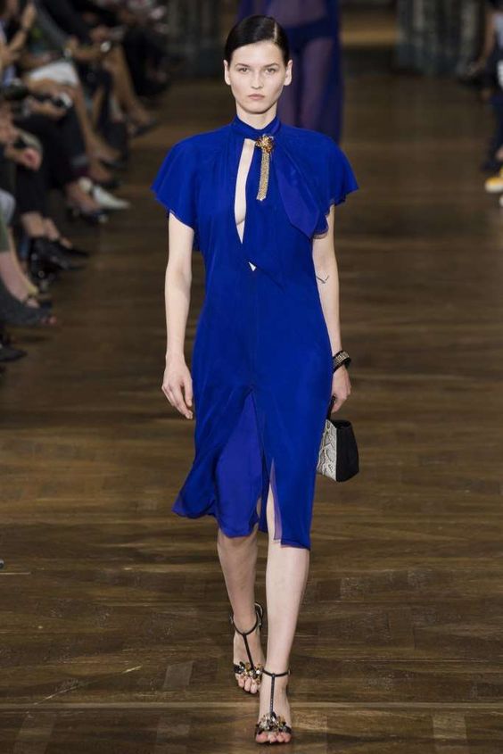
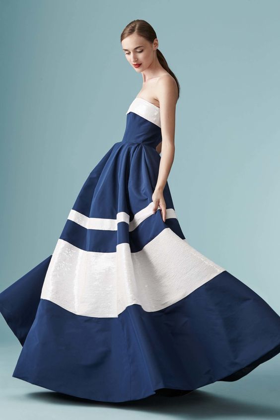
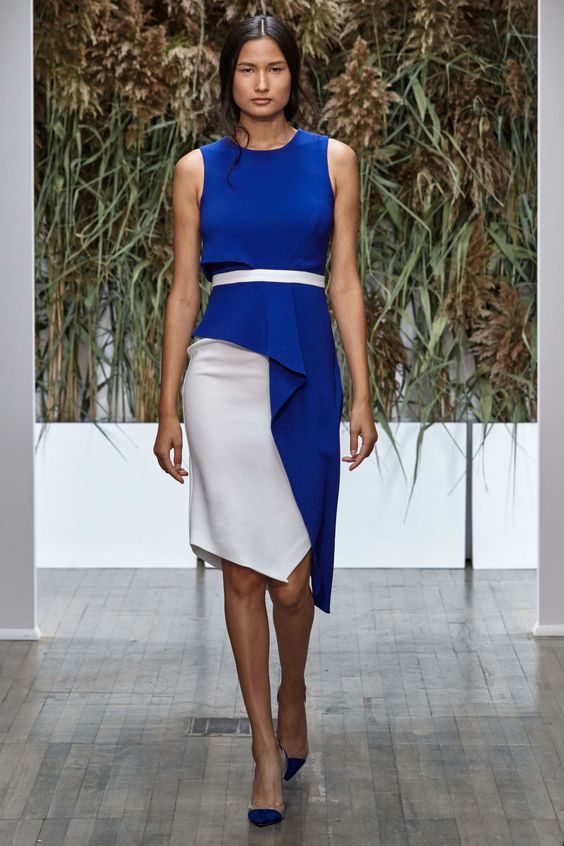
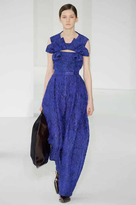
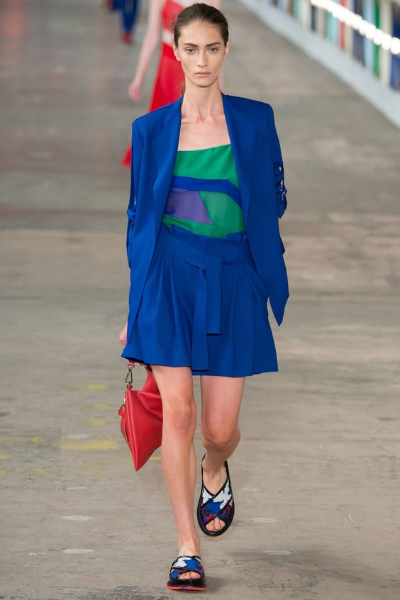
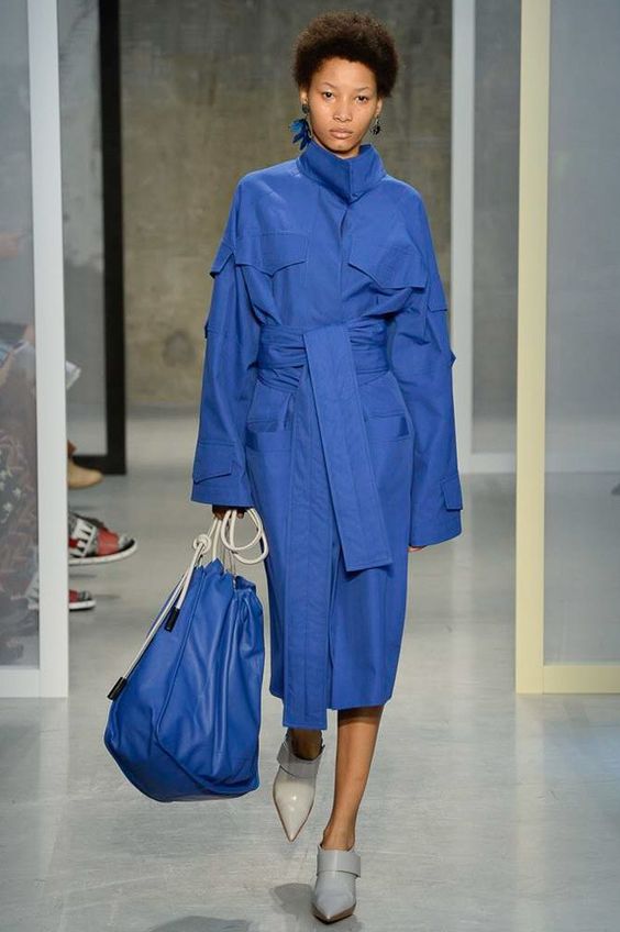
Lapis blue
Color lapis lazuli looks really luxurious. That is why the gems of the same name are used to create exquisite jewelry. This year, he was named by experts of the Institute of Color as one of the most relevant, therefore many brands use it to create clothes.
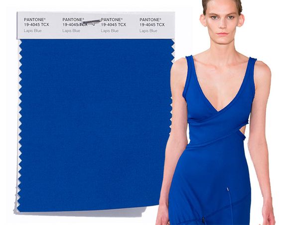
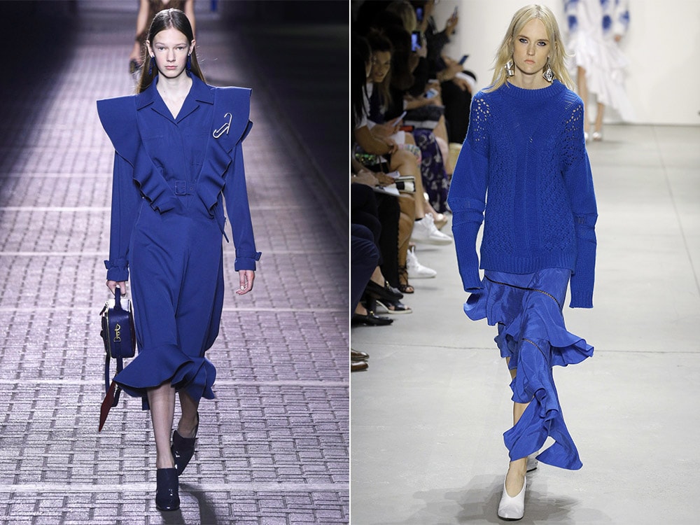
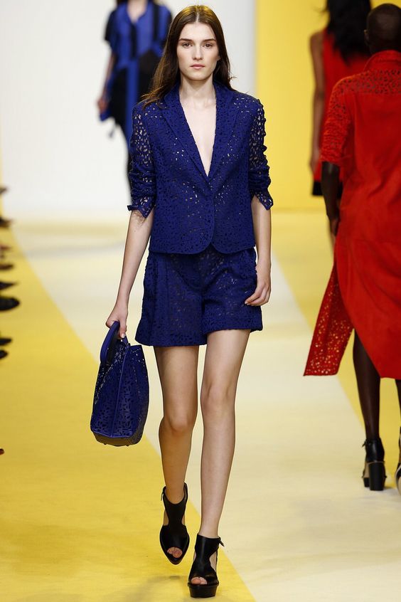
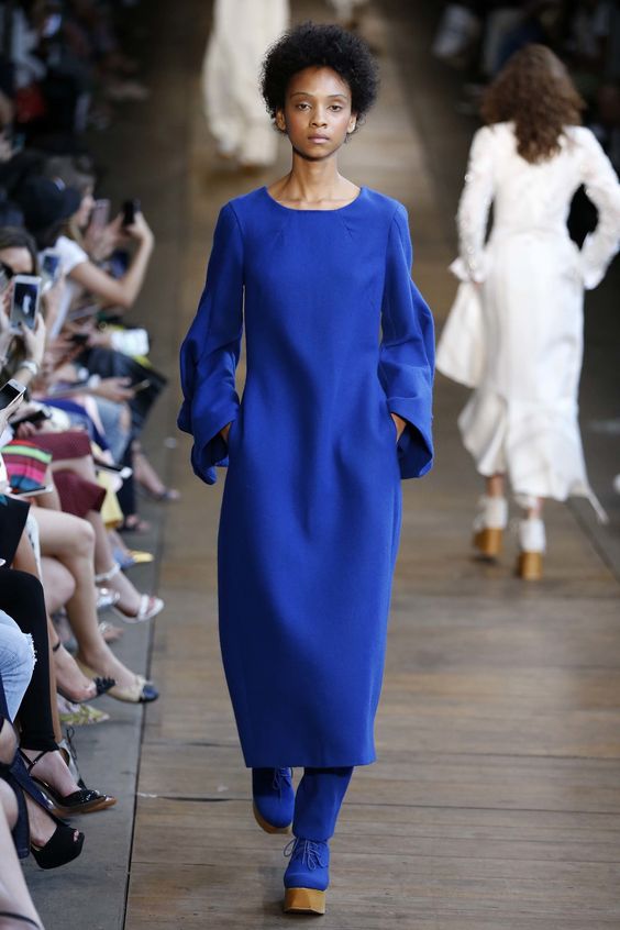
Be sure that putting on a thing in such a shade you will not go unnoticed. Best of all, it looks in combination with the same bright colors as “primrose” and “pink yarrow”.
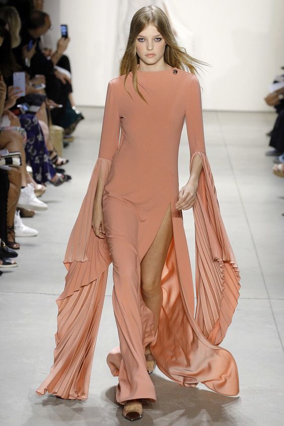
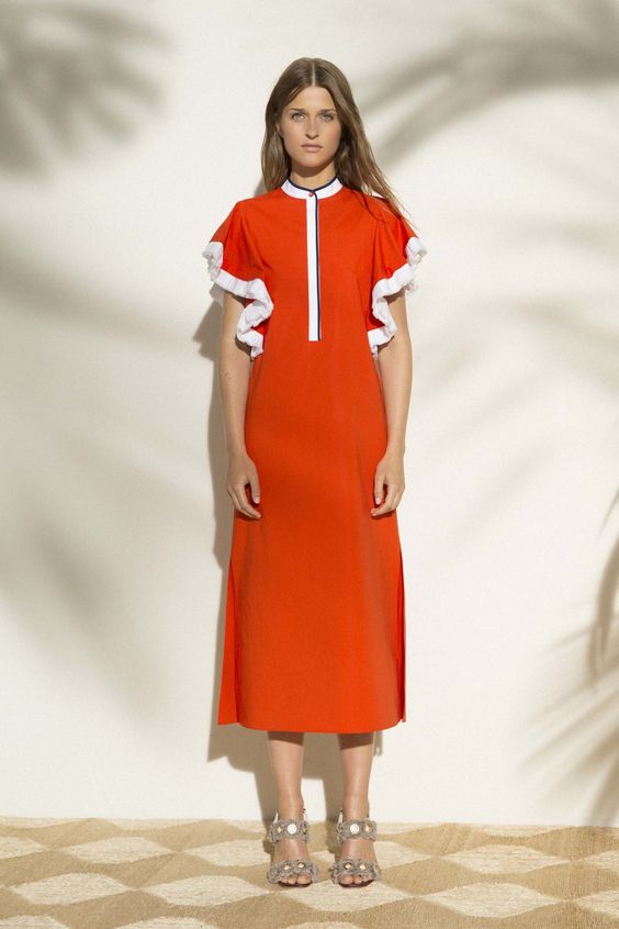
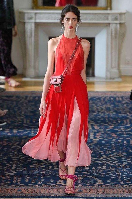
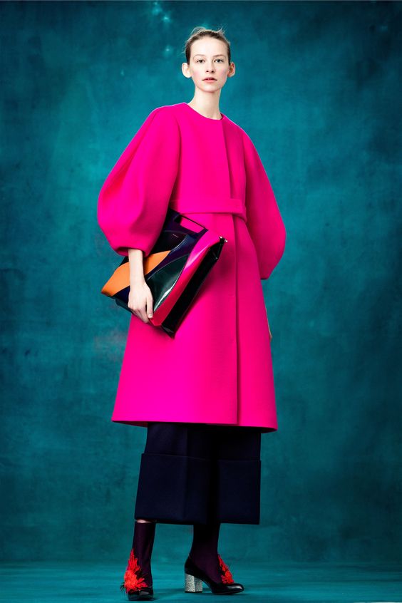
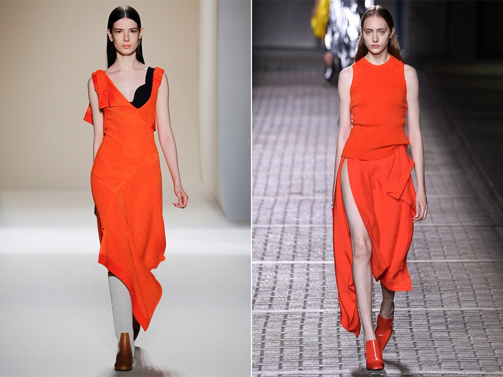
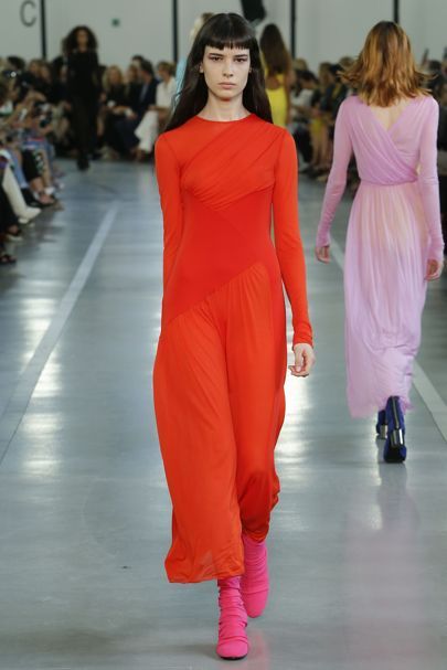
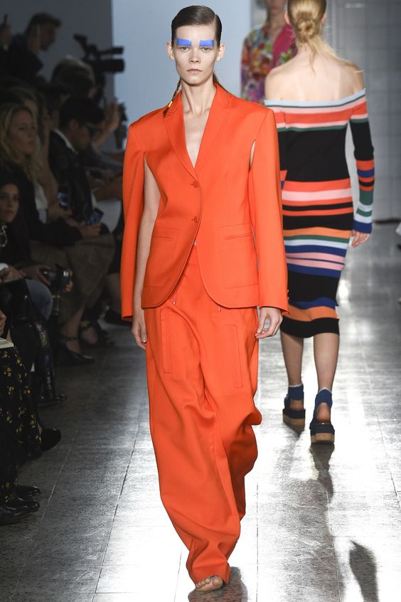
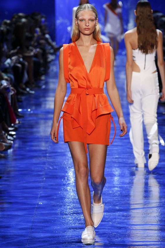
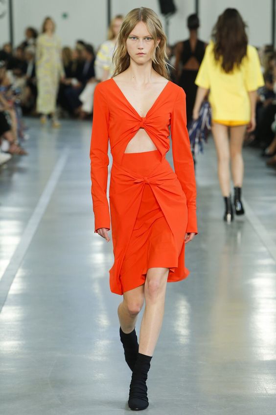
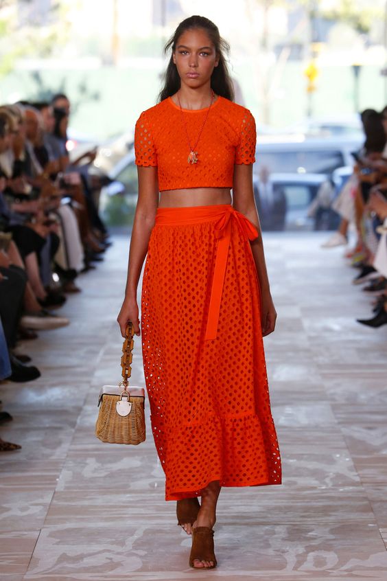
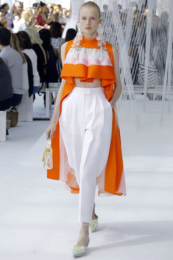
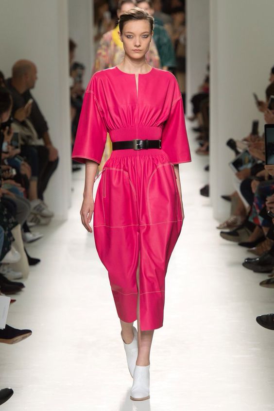
Flame
Bright, juicy fiery red color definitely stands out among all those presented for the warm spring-summer season. It is self-sufficient, therefore it is better to leave it with the only accent in the image. But to create an unusual bow, you can combine this color with other shades, but only from one color scale.
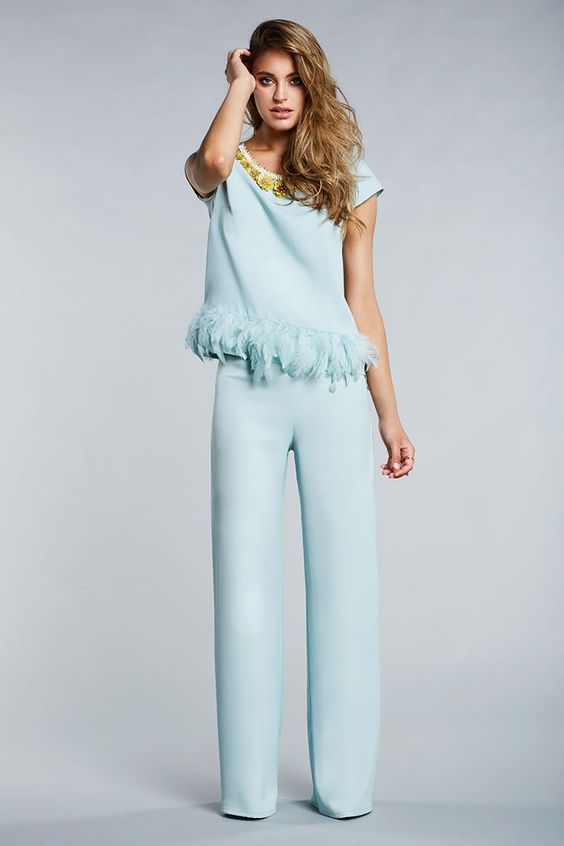
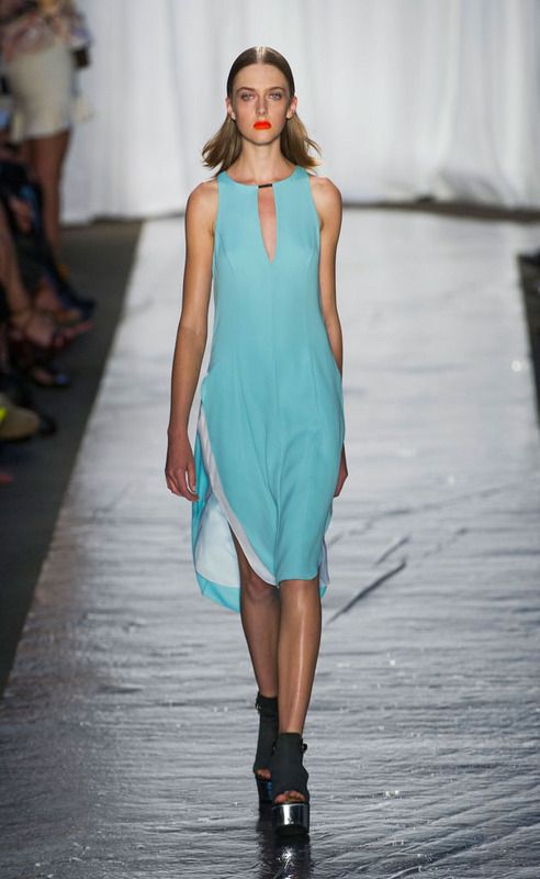
Island paradise
Translucent azure water, a paradise island, pleasure - all this is associated with this color. First of all, it is very gentle, so it is perfect for clothes in the upcoming season.
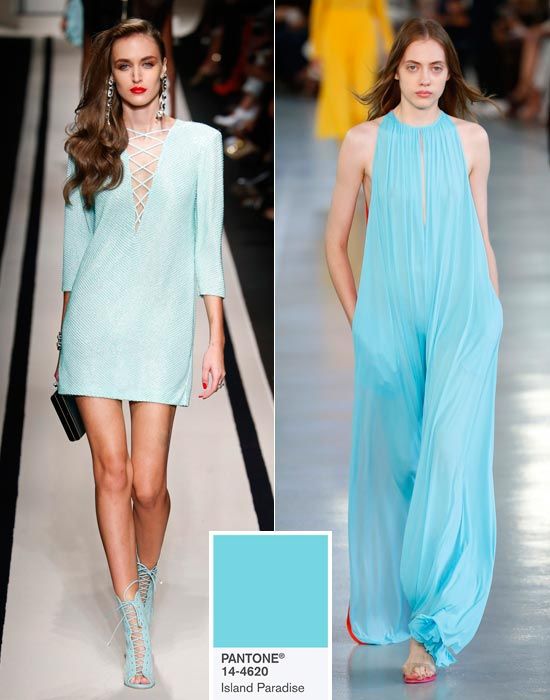
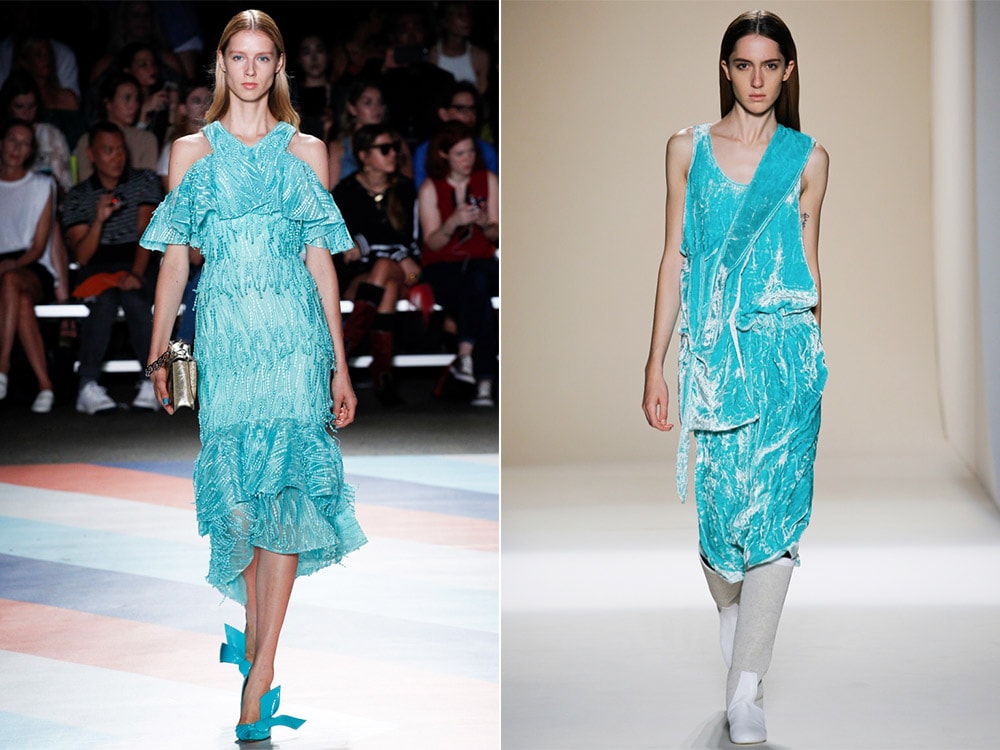
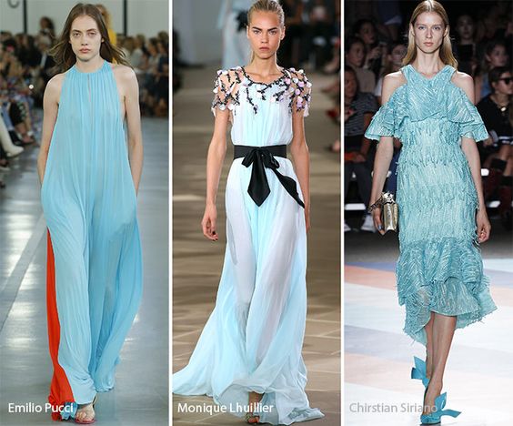
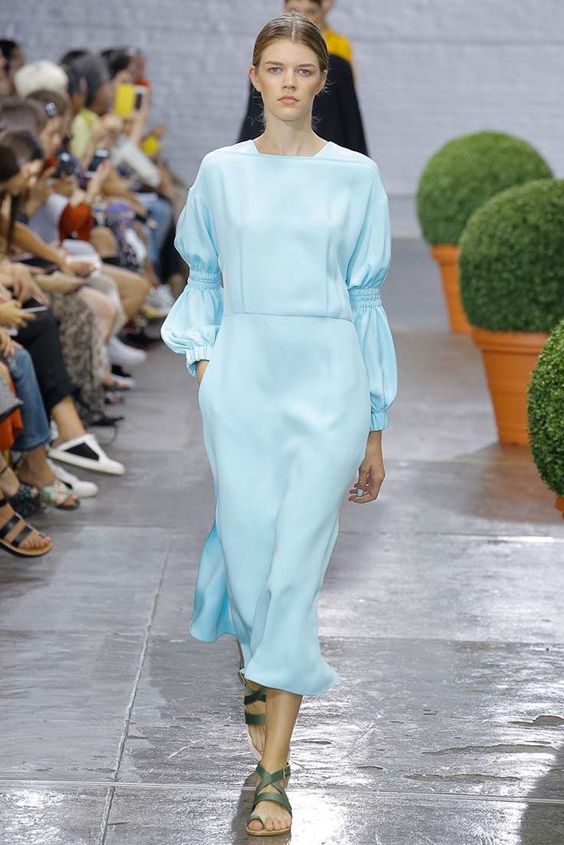
This shade will give elegance to any image, so you can apply it both for evening looks, and for everyday or business. As for the color combination, it looks most harmonious with flowers called Pale Dogwood and Hazelnut.
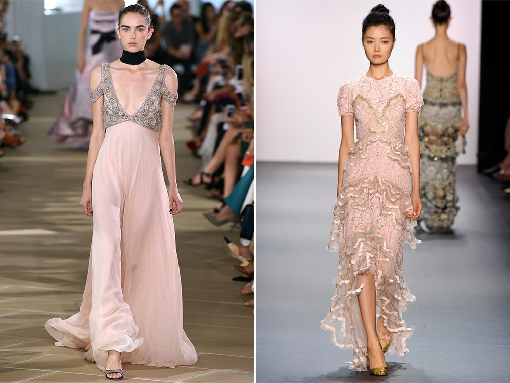
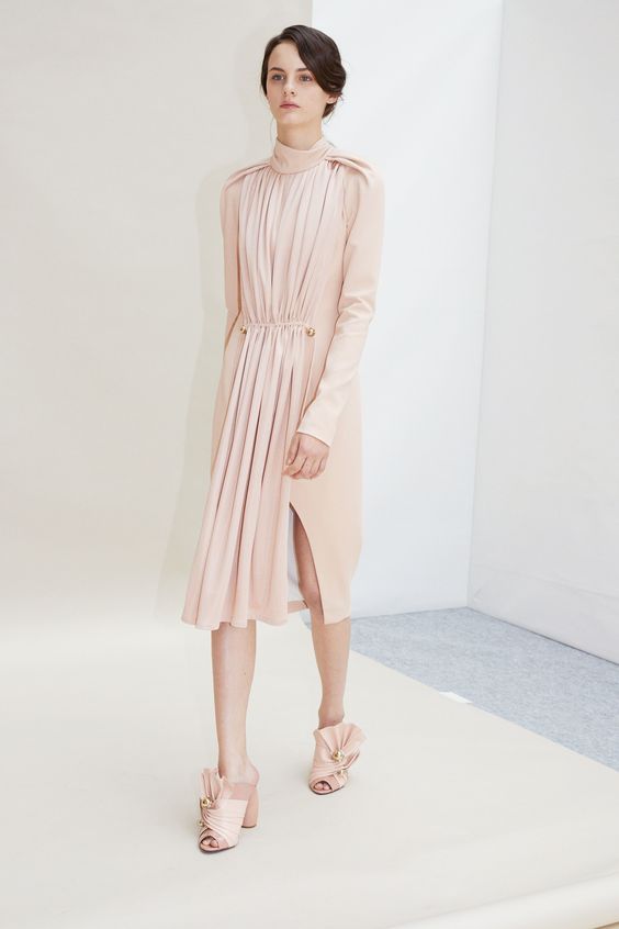
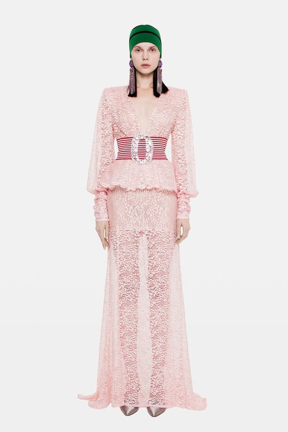
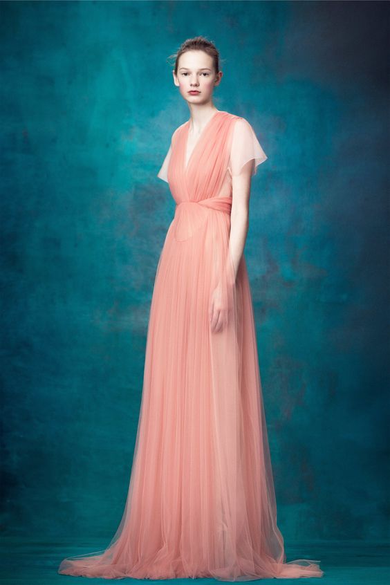
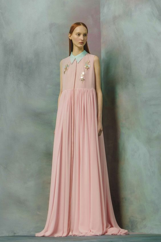
Pale dogwood
The next color that will be relevant throughout the year - “pale dogwood”. Pastel, delicate, romantic powdery color is simply created for light and pleasant textures, such as cashmere, chiffon or silk. Therefore, clothing in this color palette is perfect for a first date or walking with your loved one. You can combine this color with tones called Hazelnut or Island Paradise. This is a great solution for creating everyday images.
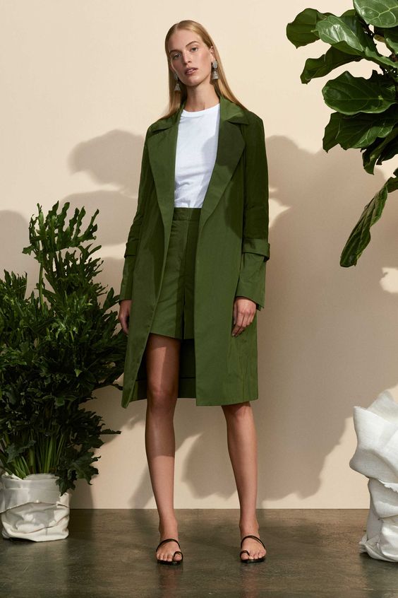
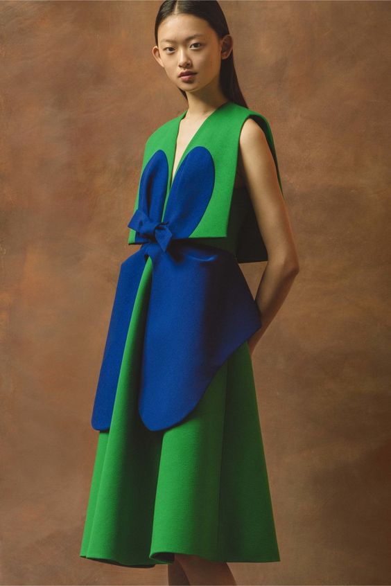
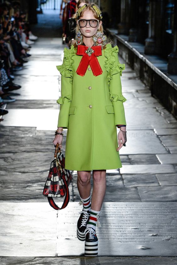
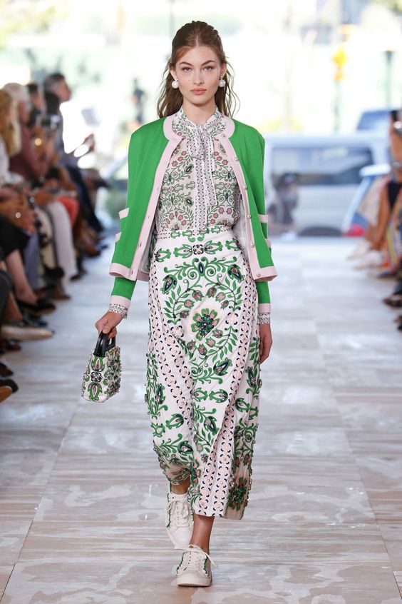
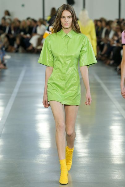
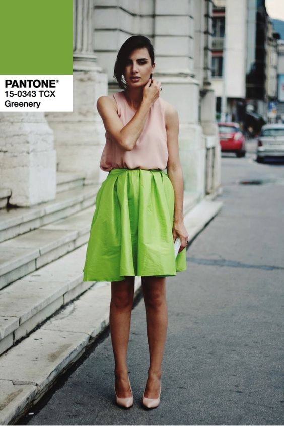
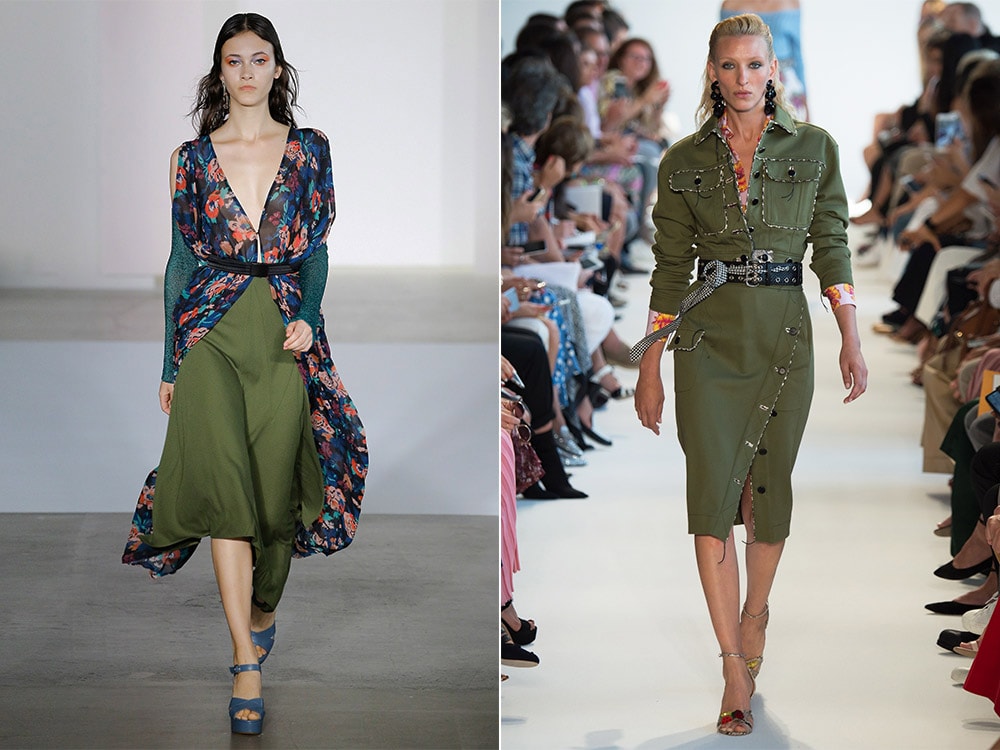
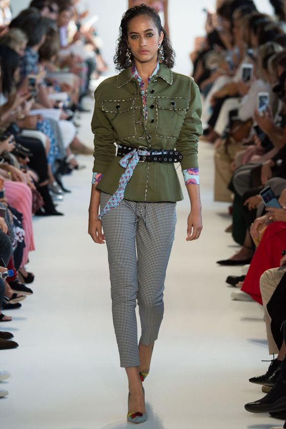
Greenery
Juicy, rich, fresh hue "greens" - ideal for hot summer days. He, like the primrose, energizes, inspires, calls for activity and life in general. That is why it is included in the list of the most relevant colors of the season.
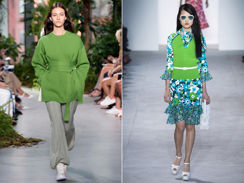
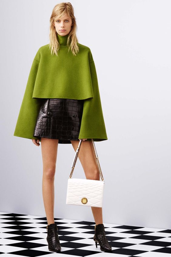
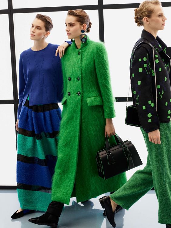
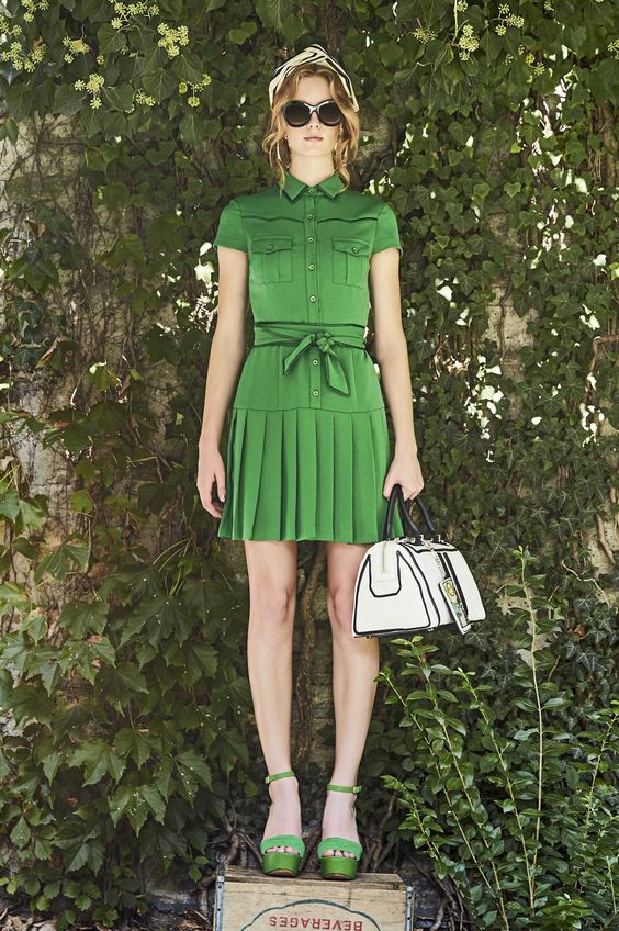
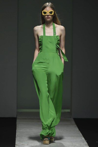
But unlike bright yellow, this option is rarely used solo. Most often it can be seen as part of a multi-color image or as a stylish accent.
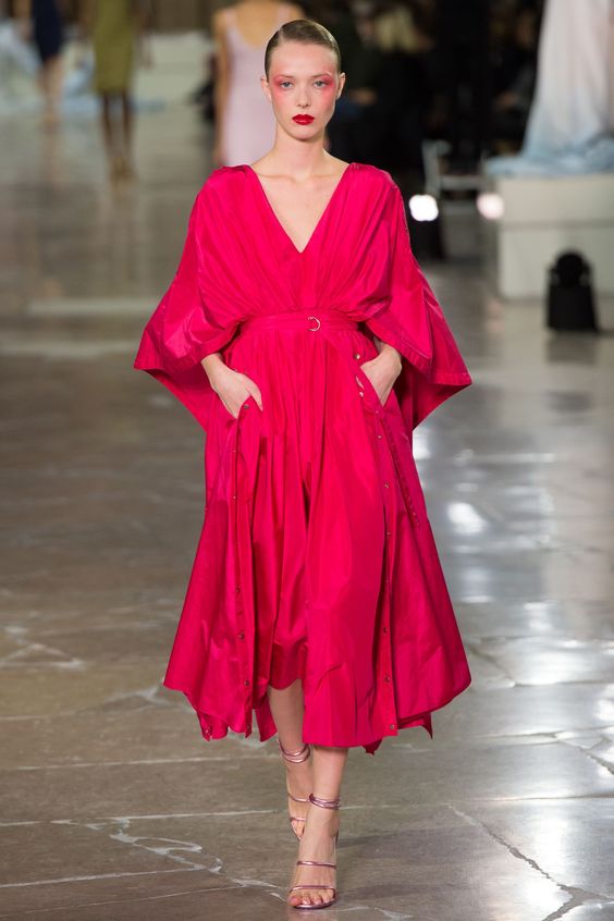
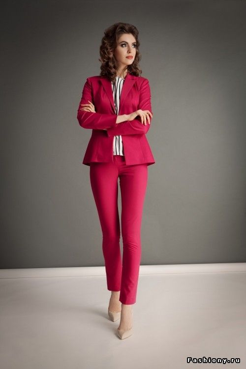
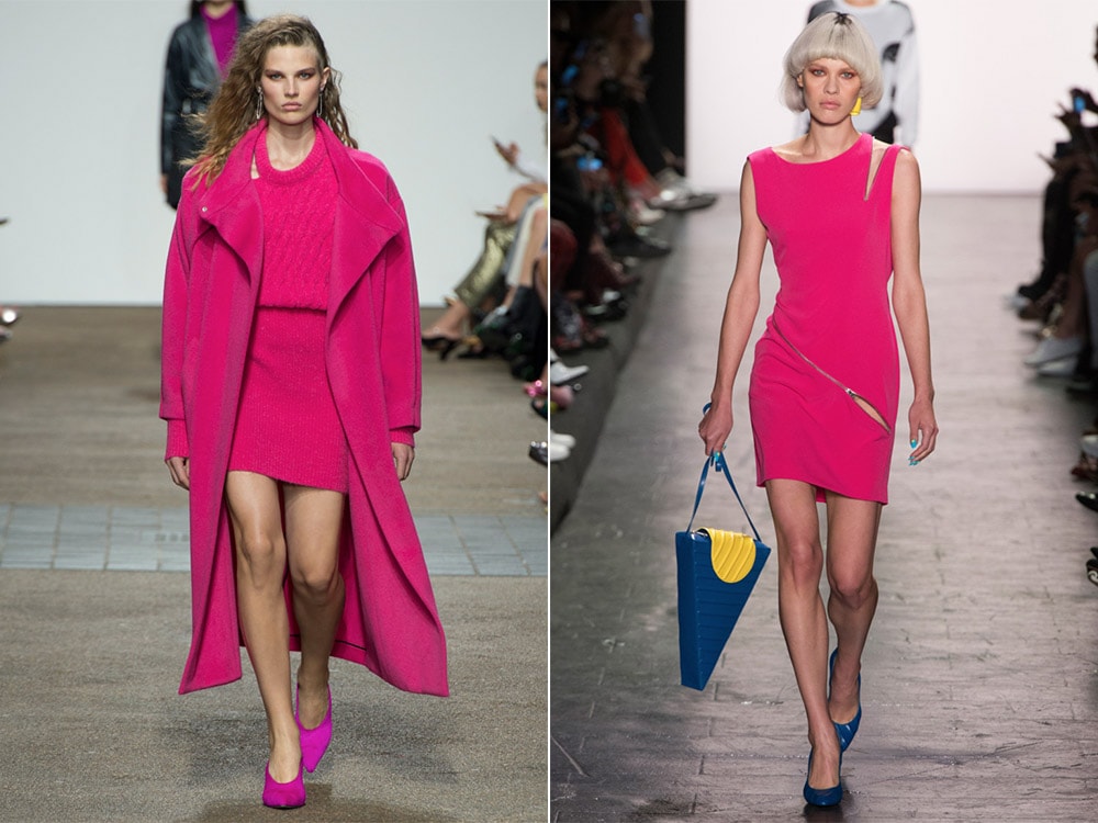
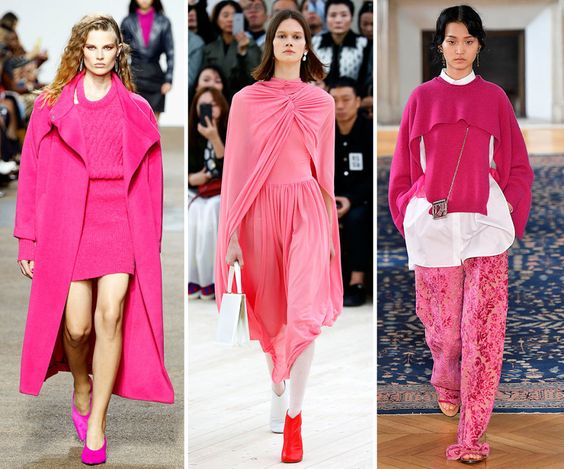
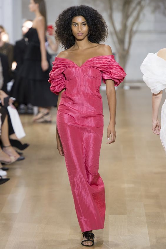
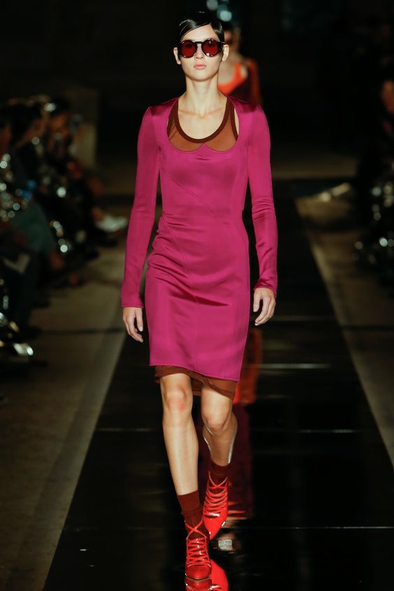
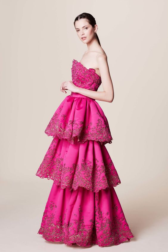
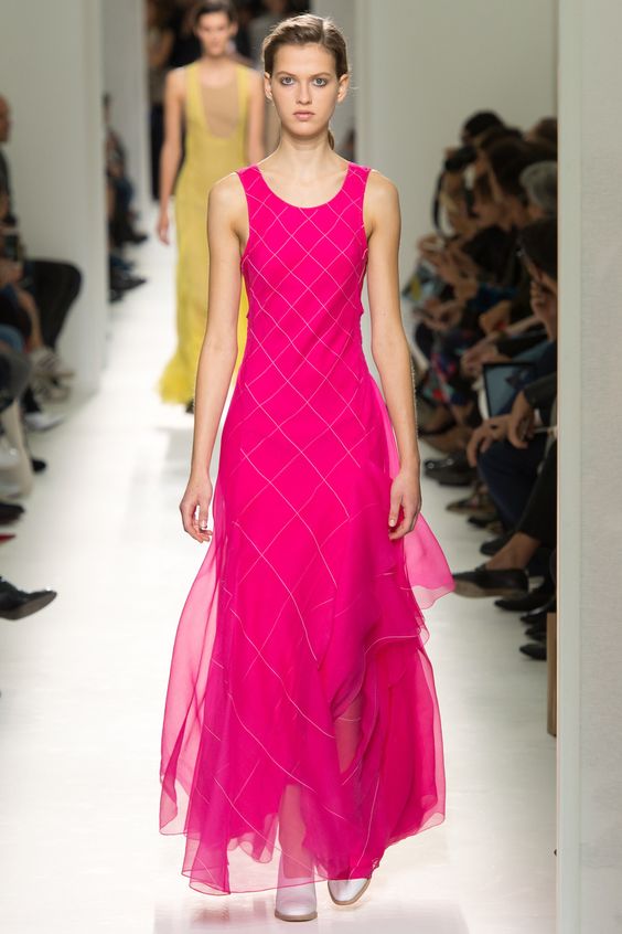
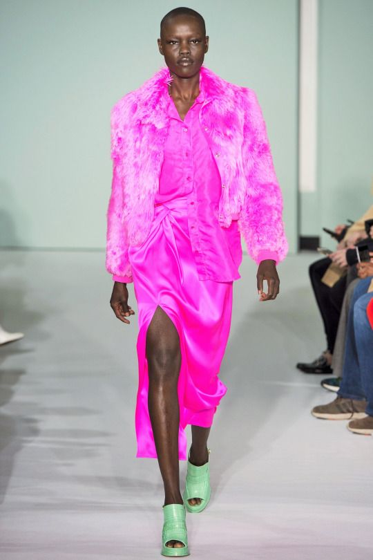
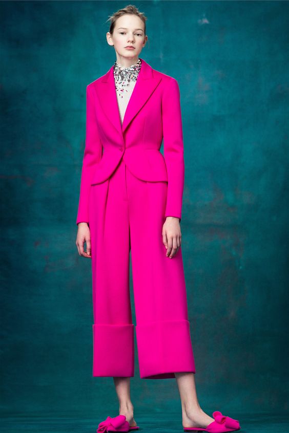
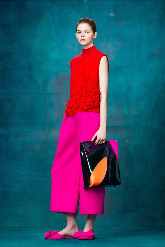
Pink yarrow
A rather exotic shade of “pink yarrow” this year ranked among the most trendy shades of the season. It looks amazing and easily emphasizes the appearance of bright, bold women. But it is used most often as an independent accent in the image. The only combination option, according to the designers, is the next color Kale.
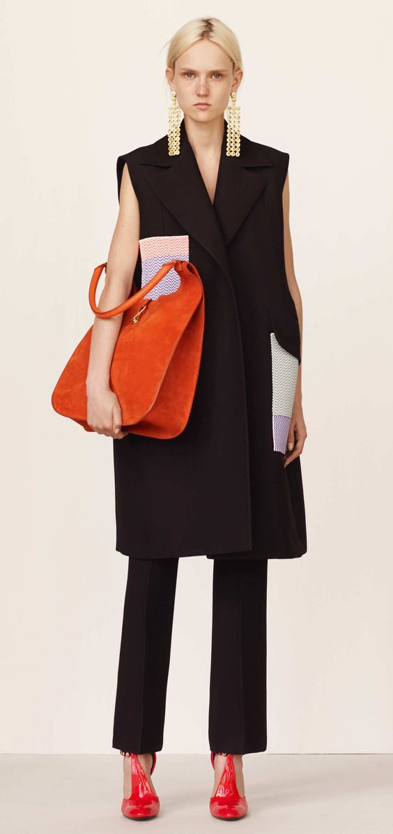
Kale
The color “curly cabbage” is known to many, and in the new season it has gained particular popularity, as it is used not only for creating clothes, but also for decorating the premises. And all because it is versatile and is used as the only color, and it goes well with other, rich shades. Notable examples are juicy Pink Yarrow, sunny Primrose Yellow and flaming Flame. Combine them with each other, and you will definitely be the center of attention.
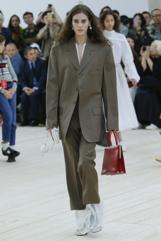
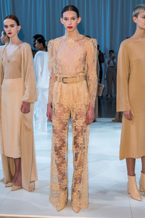
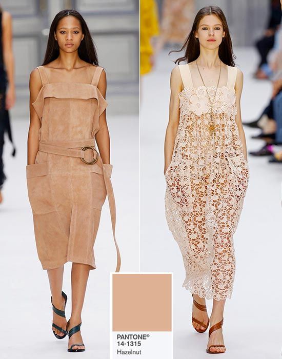
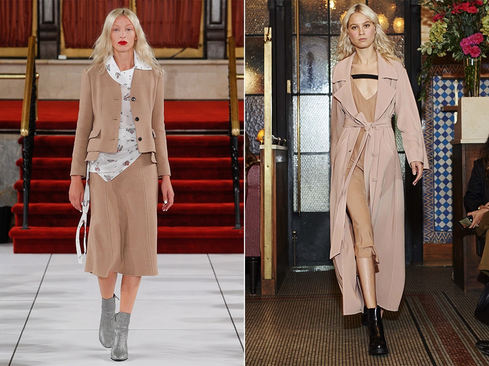
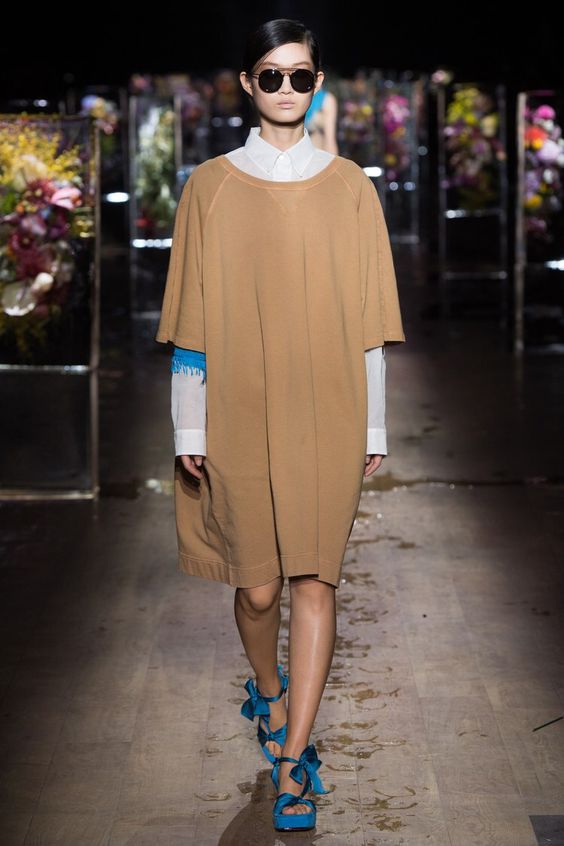
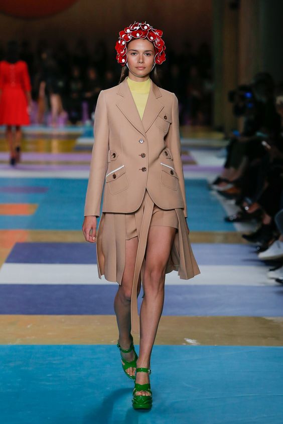
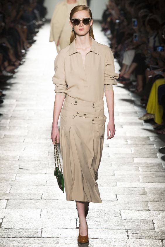
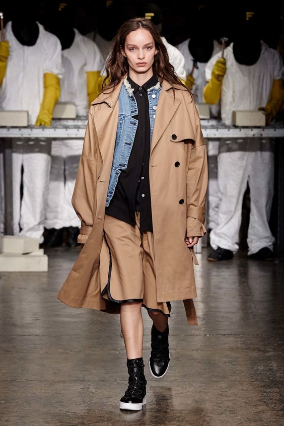
Hazelnut
The hazelnut hue has become the most anticipated for many designers, as it is universal and can be an excellent base for creating interesting, unusual images. It is very important that it is he, unlike the rest, that is suitable for absolutely all girls, regardless of their color type. It is very often used to create stylish office bows and delicate images in casual style.
Trendy colors spring-summer in the photo
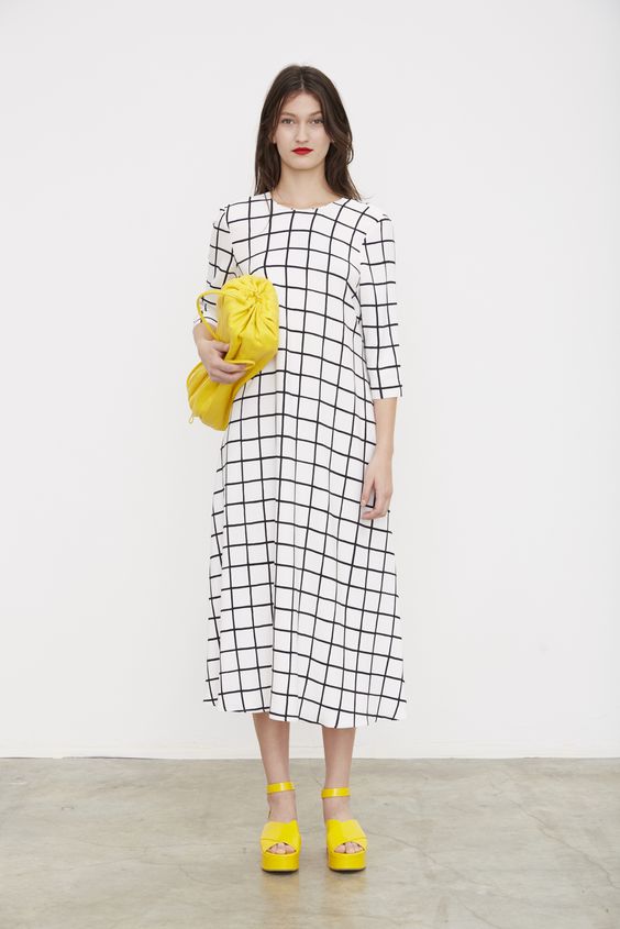
Bright, juicy colors look amazingly beautiful, but despite this, many girls are simply not ready to try these shades on themselves. If you feel just as awkward, then we recommend creating a basic wardrobe in pastel or classic shades. And as accessories, choose things in trendy colors. For example, a handbag, sandals or glasses in the color of "yellow primrose" or "pink yarrow." This will help to highlight the accents and make the image more modern.
Now you know all the fashionable colors that will be relevant in the spring and summer. Use them in the design of fashionable bows, choose bright accessories and do not forget to experiment, because it will help to create your own style.
Do you get things in bright, juicy shades or stick to the nude color range?


